Tag: user interfaces

Making it easier to safely remove that USB flash drive in Windows

Safely Remove Hardware icon in Notification area

Notification area space where hidden icons exist – click on Customize to determine how they will appear

You may want to be sure you are doing the right thing when it comes to properly and safely removing that USB flash drive, external hard disk or SD card but it may be hard to find the “Safely Remove Hardware” icon in the Notification bar at the bottom right of your screen.

What tends to happen if you haven’t been doing anything regarding removable storage is that icon becomes sidelined and available behind the up-arrow on the Taskbar. This is more so if other applications have claimed space on the Notification Bar and seldom-used icons exist behind that up-arrow.

Notification Area Icons customisation screen - when you click on Customize

Notification Area Icons customisation screen – when you click on Customize

There is a way to work around this problem by customising the Notification Bar icons to make sure that certain icons appear always.

To do this, click on the up-arrow at the left of the Notification Bar to pop up all of the icons. These will appear in a white square and you will also see the word “Customize”. Click “Customize” to see a list of the icons with each icon having its own drop-down box that determines how and when it will appear.

Options available for each icon in the Notification Area Icons customisation screen

Options available for each icon

The different modes are:

  • Show icon and Notifications. This will have the icon appear at all times and “pop up” any notification messages. Here, you may want to have the icon always visible and accessible especially if you instigate tasks from that icon.
  • Hide icon and Notifications: The icon won’t appear at all in the Notification Bar even if there is a relevant notification or it changes state. This may be useful where you find an icon always popping up messages
  • Only show notifications. The icon pops up when there is a relevant notification and will show that notification. In some cases, this icon may appear if it changes state. It may apply to “sentinel” icons that appear to crowd out the Notification Bar even though they seldom yield a notification or change state.
Preferred seting for Safely Remove Hardware And Eject Media icon

Preferred seting for Safely Remove Hardware And Eject Media icon

Here, having the “Safely Remove Hardware” icon set to “Show icon and Notifications” means that while there is a USB storage device connected to the computer or an SD card inserted in the computer, this icon will appear. This will make it easy for you to know what to click when you need to remove the USB hard disk USB memory key or memory card.

You may also find this of us with other Notification Bar icons where you are always instigating tasks from or needing to keep an eye on incase they change state like the Skype icon.

Android Wear gains more functionality

Articles

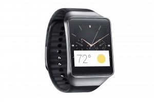
Samsung Gear Live Black Android Wear smartwatch press image courtesy of Samsung

The next iteration of Android Wear adds Wi-Fi to the smartwatch platform

Android Wear gains Wi-Fi, wrist gestures, and always-on apps | SmarterWatching

Android Wear getting big update with Wi-Fi, always-on apps, and more  | Android Authority

From the horse’s mouth

Google Android

Android Wear: wear what you want, get what you need  (Blog Post)

My Comments

A new version of the Google Android Wear wearables pllatform is being rolled out in the coming weeks which will acquire some major functionality improvements. There is talk of having this version rolled out in the coming weeks for most Android Wear devices and an increased likelihood of it appearing in newer watches.

One will be the ability to support an always-on screen with always-on apps like a traditional watch. Here, the apps can show a high-contrast power-efficient display rather than going blank when the the smartwatch isn’t being interacted with so you are able to glance at them for data.

This also ties in with different ways to gain access to other information on your Android Wear smartwatch. Firstly, you can flick your wrist to switch between cards on the display rather than brushing the watch’s face to change app cards. Similarly you can touch the screen in certain ways to show the apps you have or your contacts on your smartwatch.

As we become more addicted to using emoticons and emoji, we can hand-draw the emoticons on the watch face to show up the ones we want in our messages.

But, as far as connectivity is concerned, the new version of Android Wear has support for Wi-FI wireless networking. This is implemented in a way where you don’t even need to have your phone or smartwatch on the same logical network as each other and you can even gain access to your somartphone from your watch even if it is on a mobile-broadband connection. This could encourage smartwatch manufacturers and silicon designers to design Wi-Fi chipsets that consume very little battery power in order to obtain this functionality.

The question I have about this feature is how it will cope with public-access wireless hotspots especially where most will implement the Web-based authentication and provisioning process. Personally, I would like to see “out-of-box” support for Wi-Fi Passpoint technology with this new version of Android Wear to facilitate seamless authentication on suitable networks.

Personally, I see the new version of Android Wear as a sign that Google is putting faith in the idea of integrating Wi-Fi in to smartwatches and other wearables along with simplifying the operation of these devices.

Microsoft to benefit convertibles, detachables and other multi-input computer setups

Article

How Continuum will work in Windows 10 | CNet

Windows 10 ‘Continuum’ mode for hybrid devices showed off by Microsoft (video) | PureInfoTech

Video

Click to play

My Comments

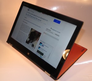
Lenovo Yoga 2 Pro convertible notebook - image-viewer view

Windows 10 will play properly with these computers what way you fold them

A problem that was often echoed with Windows 8 was the Start Screen and the Modern user interface that was optimised just for touch interfaces. This is although there are computing setups that can work between a touch interface and / or a regular mouse / keyboard interface.

These range from the so-called “2-in-1” computers of the Microsoft Surface, HP x2 and Lenovo Yoga i which can be known as convertibles or detachables and change between a regular laptop and a tablet, through people connecting keyboards and mice to tablets, including the “Adaptive All-In-One” computers of the Sony VAIO Tap 20 ilk, to touchscreen-enabled regular laptops or regular desktop computers that are kitted out with touchscreen-capable monitors.

But Windows 8 didn’t perform well for the regular mouse / keyboard interface. Here, you didn’t have the “comfort zone” of the Start Menu or desktop interface elements most of us are used to for over the last 20 years of Windows-platform regular computing. Windows 8.1 performed a few upgrades to try to bridge the gap but Windows 10 has approached this more sincerely.

Here they have a new Start Menu that also has active Tiles for Windows Store apps and this can be “shoehorned” to suit your screen layout. It is also optimised for touch-enabled setups like a “2-in-1” set up as a laptop, a touch-screen-equipped regular laptop or a desktop computing setup equipped with a touch-enabled monitor. This is part of a desktop user experience optimised still for the keyboard and mouse.

But if you detach the keyboard from an HP x2 detachable, fold over a Lenovo Yoga or slide the keyboard under a Sony VAIO Duo, the display adapts to a full-screen-optimised “tablet” mode. The same thing happens if you turn off your Bluetooth keyboard and mouse that you have connected to your Windows tablet. This has a reduced clutter view and program selection is through the Start Screen “dashboard” that was par for the course on Windows 8. There is the ability to bring this on manually if you like to, at times, mouse around an uncluttered workspace or simply have that “dashboard view”.

At least the folks at Redmond have made the effort to cater for multiple-interface computer users, especially the 2-in-1 users or people who have touch-capable laptops. Let’s not forget that a touch-capable monitor for a desktop computer setup or a touch-enabled laptop doesn’t have to be considered an unnecessary luxury.

The Freebox Révolution benefits from Freebox OS to be like a recent NAS

Articles – French language

La Freebox Révolution accueille Freebox OS – DegroupNews.com

Mise à jour Free : capacités de partage renforcées | 59Hardware.net

My Comments

Just lately, Free had rolled out their latest firmware update for the Freebox Révolution “n-box” router. This has various improvements like cloud-assisted remote management and storage access, including management of the “FreePlug” HomePlug AV power-supply units for these devices.

But they describe this firmware not as firmware for customer-premises equipment but as “Freebox OS”. This is like placing the Freebox Révolution on the same stage as one of the recent consumer or small-business network-attached storage devices. Here, they lay out the management dashboard for this device so it reminds you of a desktop operating system’s GUI, This is carried over whether you use it from a Web browser or the freely-downloaded iOS or Android mobile apps.

They also are publishing an application-programming interface so that third-party software developers could create management programs for the Freebox Révolution. This could allow for things like management software which works native to particular host-device operating environments through improved dashboard software.

But who knows what is in store for this device once the groundwork is laid down in this operating system. For example Free could start curating an app store and software-development environment for the Freebox Révolution so that others could add functionality to this device. Think of such options as access to third-party cloud storage, additional application-level gateway functionality and, perhaps, adding business-grade features like VPN-endpoint or VoIP “virtual extension” abilities to a consumer-grade device.

It is another example of the lengths the French telecommunications companies are going to to yield multi-play Internet services that are facilitated with highly-capable equipment.

At last the iPad has a Facebook client app

Articles

The iPad gets a Facebook app, finally | Engadget

The Official Facebook App for iPad Is Finally Here | Gizmodo

Facebook Finally Launches Its Own IPad Application | AllFacebook.com

Facebook unveils iPad app, new mobile platform for developers | SmartCompany (Australia)

From the horse’s mouth

Introducing Facebook For iPad

Download link

iTunes App Store

My Comments

Previously, I posted an article on the idea of creating and implementing desktop and tablet-computer client programs for popular social-network services. Here I raised issues of optimisation for the host’s user interface, integration with local hardware and software resources as well as system performance issues; compared to software-maintenance and interlinking with service-based advertising as drawbacks.

Now Facebook have released an official client for the Apple iPad tablet computer. This client demonstrates the advantages of a client-side app for the iPad; with functionality like an always-visible presence list, proper response to the touch gestures, “to-the-edge” full-screen photo viewing as well as a multi-column view.

They have also answered a call from people who play FarmVille and similar games by offering the ability to play these games on the iPad using this platform’s Facebook client.

Of course time would tell when a port for this client is made available for the other popular tablet platforms like Android Honeycomb or Blackberry Playbook. But I often wonder whether Facebook will even issue a client application for the Windows or Macintosh desktop-computing platforms.

Mobile Users Becoming More Susceptible to Phishing Scams

Article

Mobile Users More Susceptible to Phishing Scams – www.enterprisemobiletoday.com

My comments

Why are mobile (smartphone and tablet-computer) users more susceptible to phishing scams?

The main reason is that the operating interface on the mobile computing devices is totally different to the operating environment on a desktop or laptop computer.

One main reason is that most of these devices don’t have a large display area in their Web browsers or email clients due to them having smaller display screens. This leads to the software designers designing a “clean and simple” user-interface for software pitched at these devices with minimal controls on the interface; which eliminates such concepts as fully-qualified email addresses and URLs. A lot of these devices even conceal the address bar where the user enters the URL of the page to be visited unless the user directly enters a URL that they intend to visit. Similarly, the email client only shows the display name for the incoming email, especially in the commonly-used “list-view”.

It is also augmented by the lack of a “B-option” interface in a mobile operating system. This is compared to what is accepted in a desktop operating environment with functions like right-clicking with a multi-button mouse or using Ctrl-Click on a single-button-mouse-equipped Macintosh to gain access to a context-sensitive secondary menu. Similarly, all scientific calculators used an [F] key and / or an [INV] key to modify the function of formula buttons either to gain access to the inverse of a formula or obtain another formula.

Such an option would allow the user to select a “function” button before selecting the option or displayed item in order to open a context-sensitive secondary-function menu or select a secondary function.

This discourages users from checking the URL they intend to click on in an email or the fully-qualified email address for an incoming email.

What could be done?

The Web browser and email client could support “phish detection” which could provide a highly-visible warning that one is heading to a “phishy” Web site or receiving a suspicious email. This function is just about provided in every desktop email client that most of us use but could be implemented in a mobile email client. Similarly, an email service could integrate filtering for phishy emails as part of its value-added spam-filter service.

There could even be the ability to have a “magnifying glass” touch button on the browser or email-client user interface which, when selected before you select an email address or URL, would show the fully-qualified email address or URL as a “pop-up”. This would have the domain name emphasised or written in a distinct colour so you know where you are going. This same interface could also be in place if one enters a URL directly in to their Web browser.

The mobile browsers could also support the Enhanced Validation SSL functionality through the use of a distinct graphic for the fully-validated sites. As well, a wireless-broadband provider or Wi-Fi hotspot could offer a “phish-verify” proxy service so that users can see a “red flag” if they attempt to visit a phishy Website similar to what happens in Internet Explorer when a user visits a suspicious Website.  This is similar to how some mobile providers warn that you are heading to a website that isn’t part of their “free-use” Website list and they could integrate this logic in to these proxy servers.

Conclusion

In general, the industry needs to look at the various user scenarios that are or are likely to be in place to improve secure Web browsing and email. Then they have to enable user-experience measure that can allow the user to verify the authenticity of Websites and emails.

This is more so as the small screens end handheld devices end up as the principal Web user interface for people who are on the move. It will also become more so as the “10-foot” TV interface, with its large screen with large text and graphics, D-pad navigation technique and use by relaxed and mostly-tired viewers relaxing on comfortable furniture becomes a mainstream “lounge-room” interface for the Web.